
ME(1987)
![]()
![]()
![]()
![]()
![]()
![]()
![]()
![]()
![]()
![]()
![]()
![]()
![]()
![]()
Wieden+Kennedy SP(2017)

Nike World Cup BNT(2017)

BR Native Ingredients(2019)

Tennis Court(2017)

Some Italic Letters(2015)

The Empty Shop(2013)
Made By Woodworks(2019)

Red Bull Station(2016)


AC Typeface(2019)

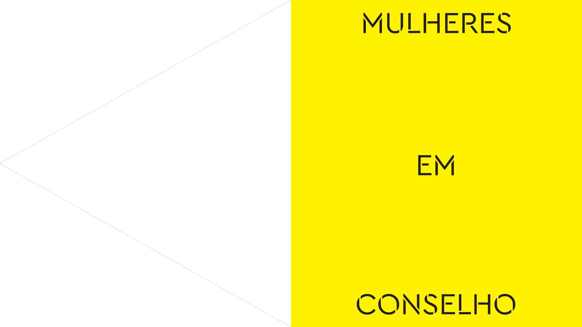
Women in Concil(2016)
Words To Watch(2016)

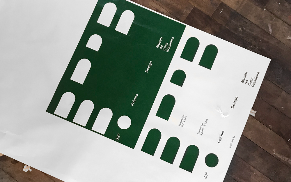
33º PDMCB(2019)
Tic-Tac-Toe(2012)

01
02
03
04
05
06
07
08
09
10
11
12
13
14
15
02
03
04
05
06
07
08
09
10
11
12
13
14
15
X
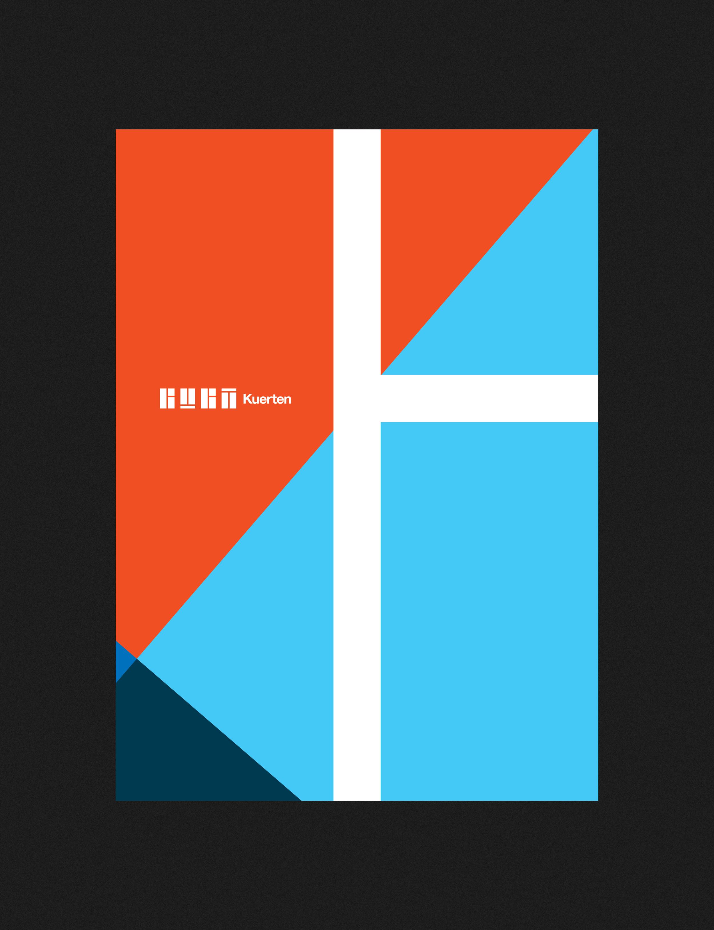
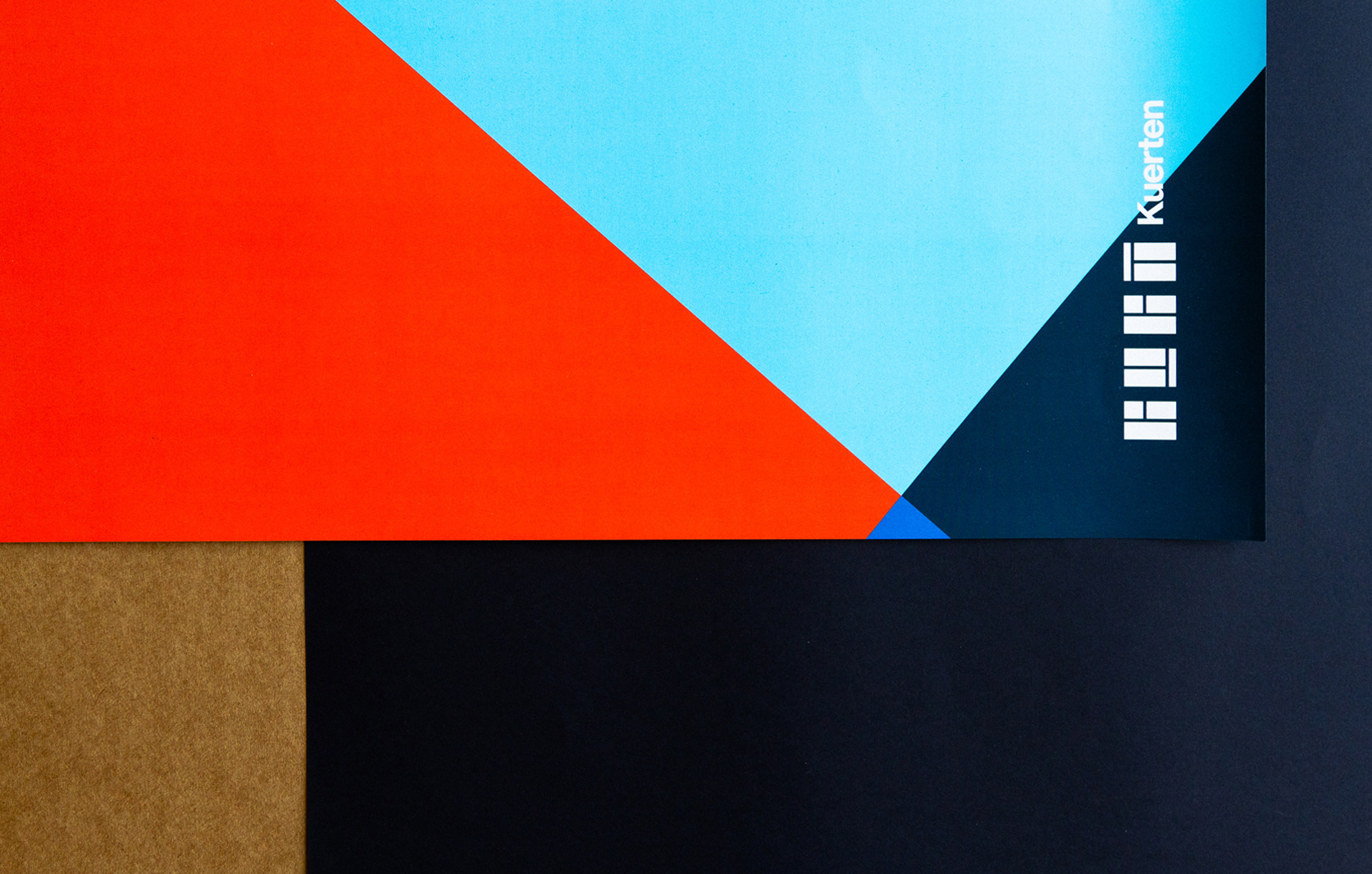
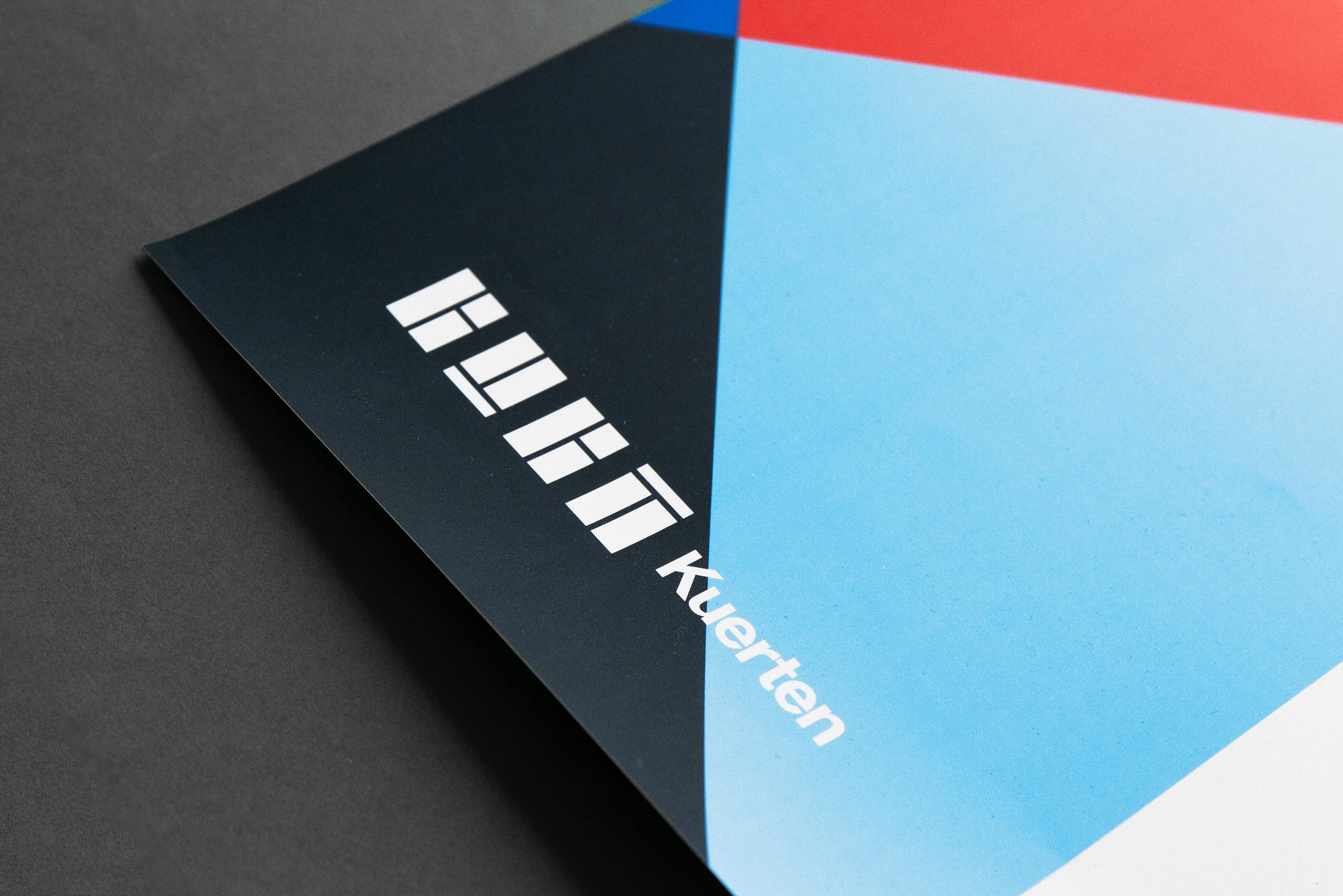
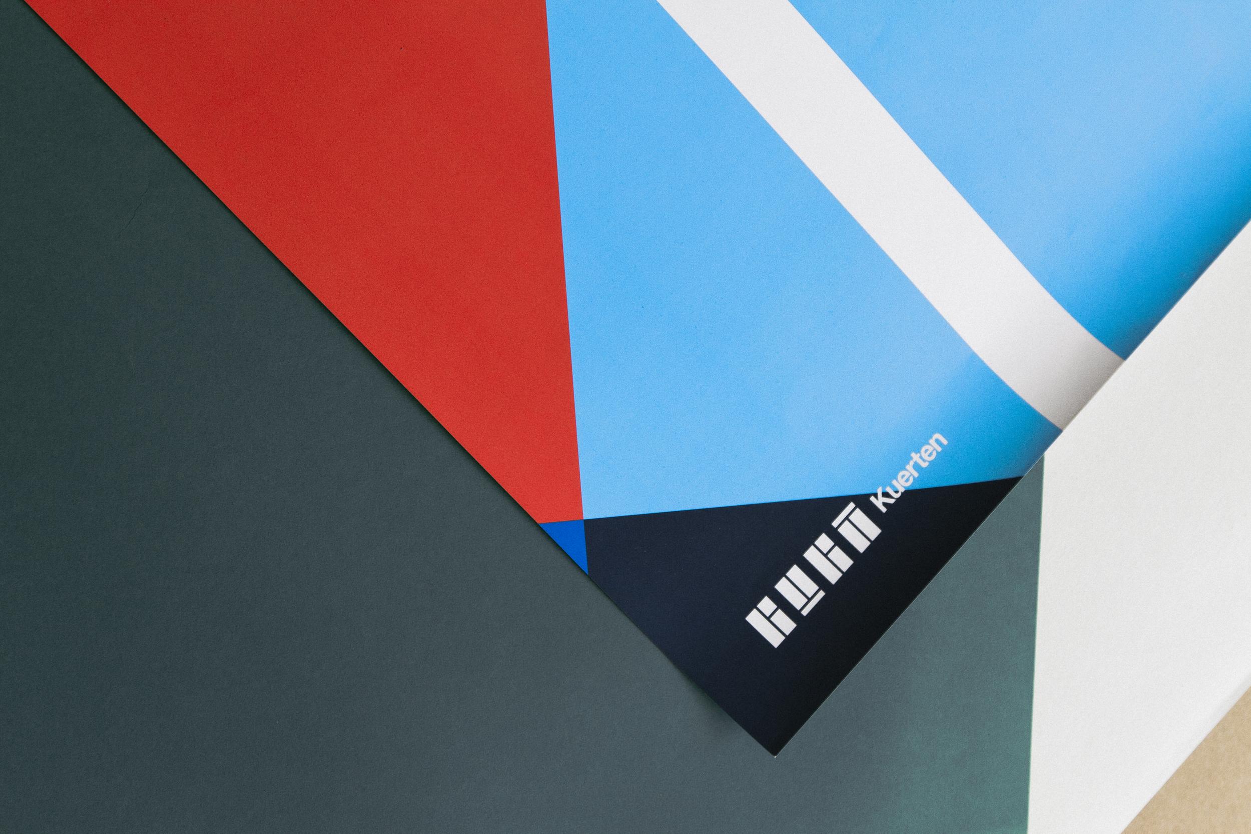
“Gustavo Kuerten, born September 10, 1976, also known as Guga, is a retired former World No. 1 tennis player from Brazil. He won the French Open three times (1997, 2000, and 2001), and was the Tennis Masters Cup champion in 2000, becoming the only player to defeat Pete Sampras and Andre Agassi in the same major tournament. Kuerten suffered many problems with injuries which led him to miss a number of tournaments between 2002 and 2005. After a few failed attempts of comebacks, he retired from top-level tennis in May 2008. Kuerten is commonly known as Guga, an affectionate nickname which is a common abbreviation of the name Gustavo in Portuguese-speaking countries.” (Wikipedia)
The biggest challenge of this project was how to represent a tennis athlete without falling into visual clichés. After some visual explorations, we found a path inside the place that Guga Kuerten made his name, the courts.
![]()
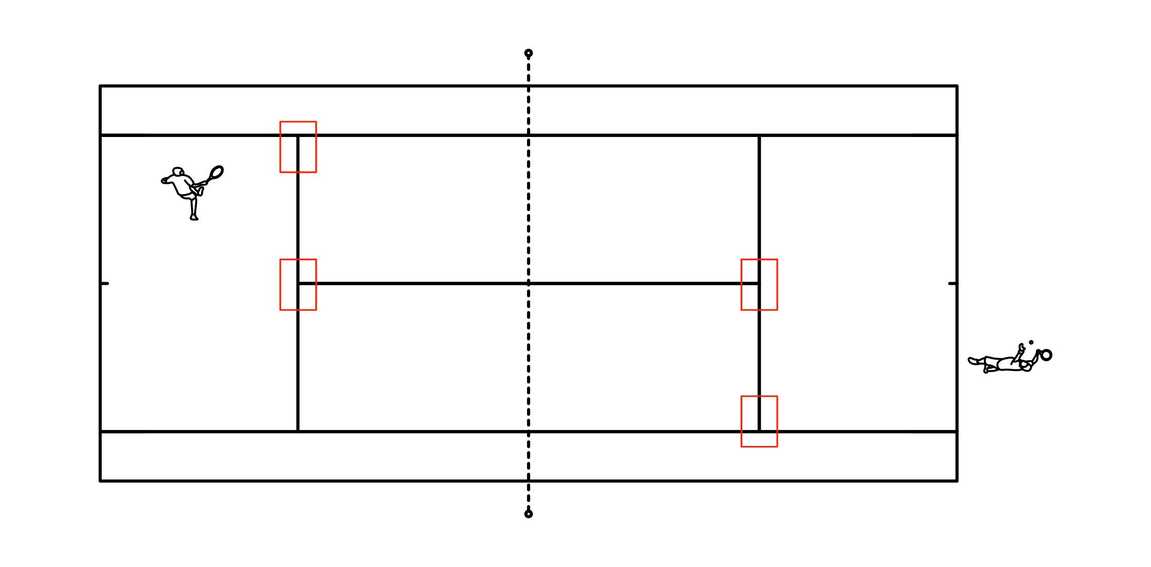
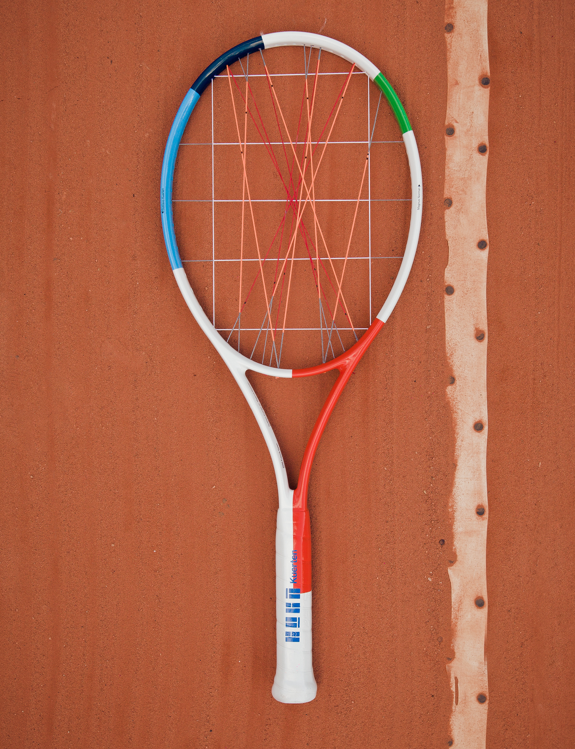
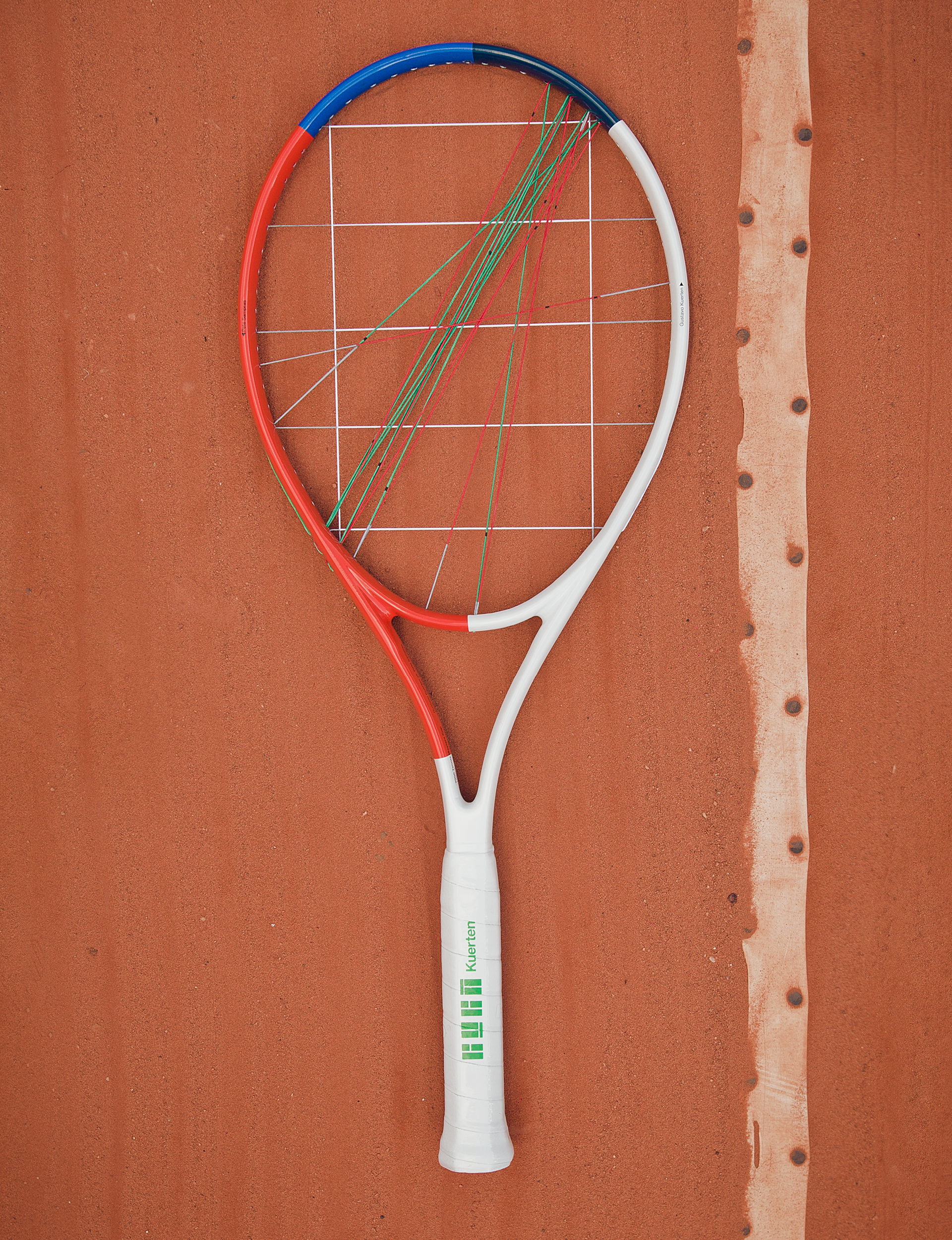
From the crop of the famous "T" on the tennis courts we were able to find the letters that form his name in a graphic and abstract way, forcing people to take a second look at this symbol.
![]()
Formation of the GUGA Kuerten logo.
![]()
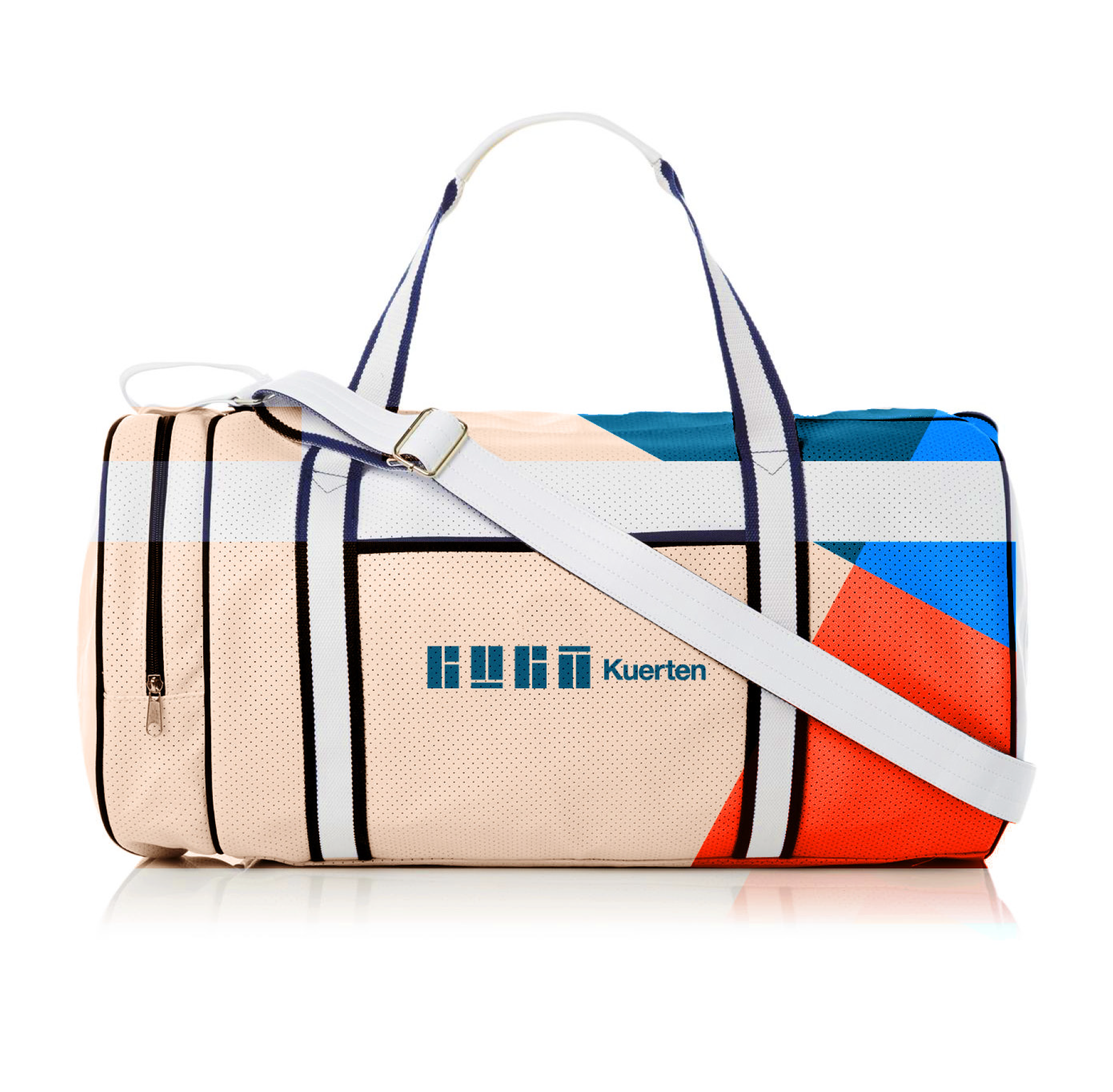
The main colors were taken from the three main styles of courts: clay, fast and grass.![]()
The movement of the tennis ball on the courts brought inspiration to build the other elements for the composition of the his visual identity.
![]()
![]()
![]()
![]()
![]()
![]()
![]()
![]()
![]()
![]()
![]()
![]()
![]()
![]()
![]()
![]()
![]()
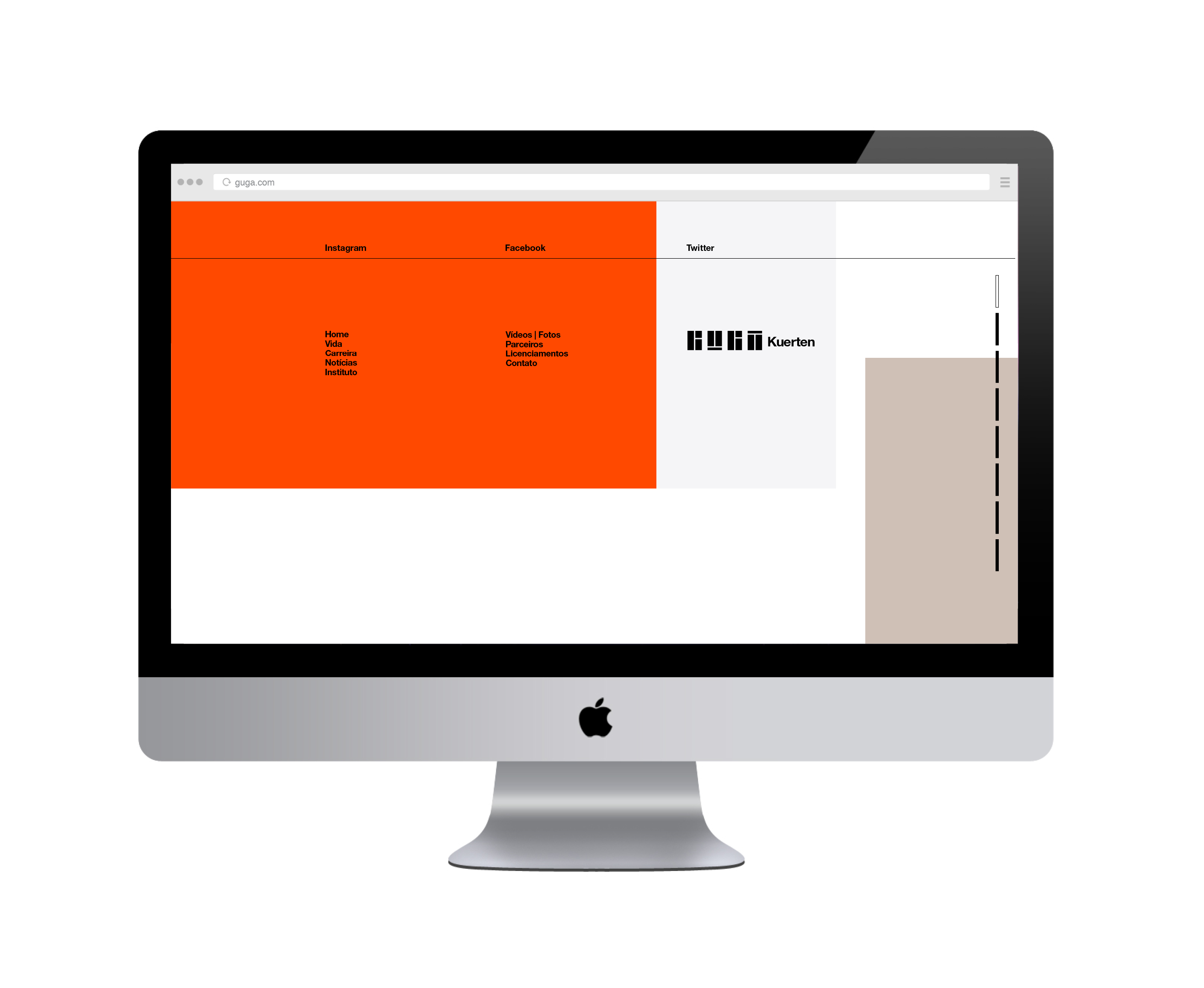
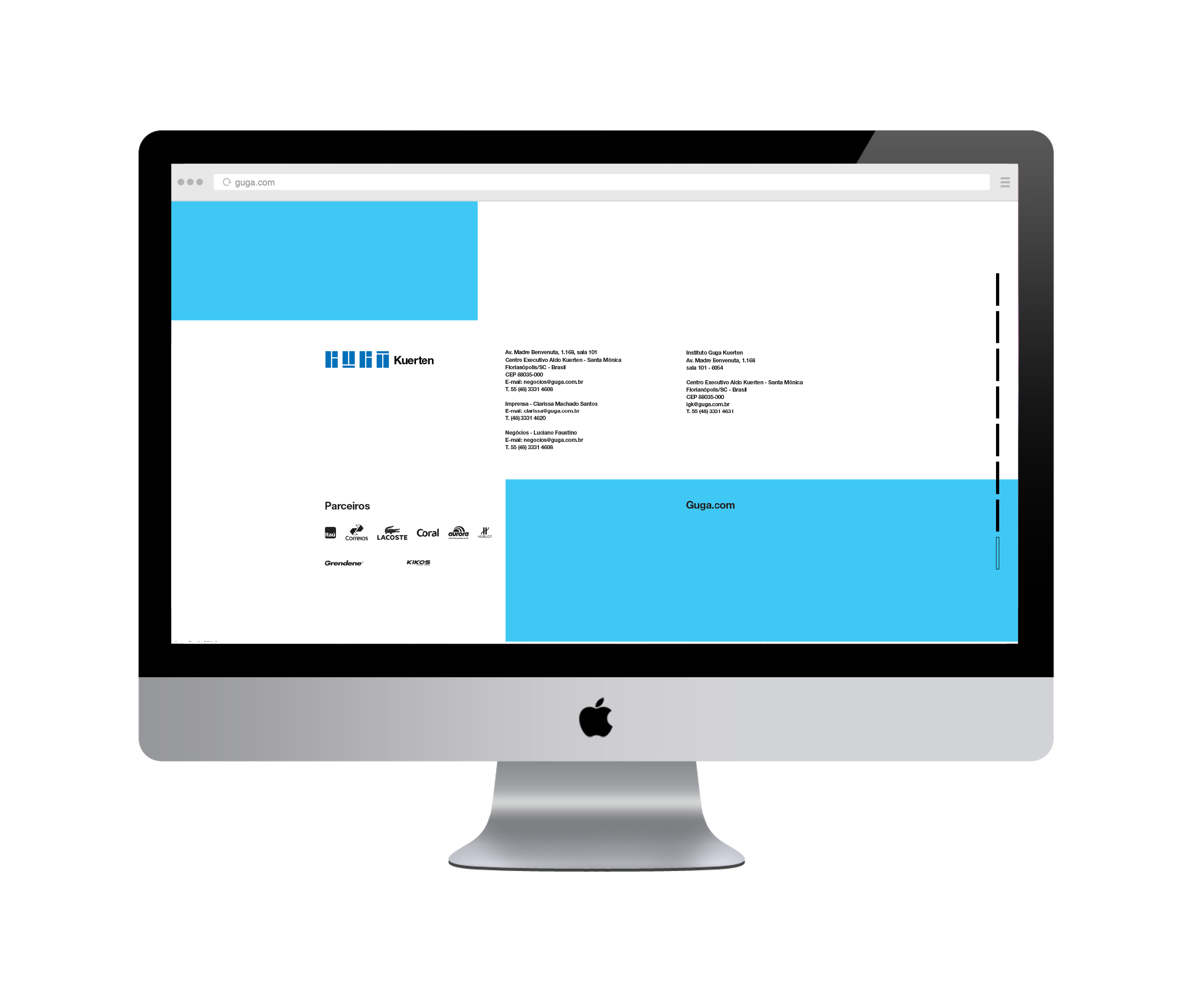
![]() unpublished website
unpublished website
![]()
![]()
![]()
![]()
![]()
![]()
Brand New review︎
•
Agency: LDC
Brand Designer: Eduardo Tallia
Visual Identity Designers: Eduardo Tallia and Paula Padilha
Head of Design: Eduardo Tallia
Creative Directors: Cássio Moron, Fábio Saboya Sérgio Mugnaini and Raphael Franzini
Chief Creative Officer: Guga Ketzer
“Gustavo Kuerten, born September 10, 1976, also known as Guga, is a retired former World No. 1 tennis player from Brazil. He won the French Open three times (1997, 2000, and 2001), and was the Tennis Masters Cup champion in 2000, becoming the only player to defeat Pete Sampras and Andre Agassi in the same major tournament. Kuerten suffered many problems with injuries which led him to miss a number of tournaments between 2002 and 2005. After a few failed attempts of comebacks, he retired from top-level tennis in May 2008. Kuerten is commonly known as Guga, an affectionate nickname which is a common abbreviation of the name Gustavo in Portuguese-speaking countries.” (Wikipedia)
The biggest challenge of this project was how to represent a tennis athlete without falling into visual clichés. After some visual explorations, we found a path inside the place that Guga Kuerten made his name, the courts.
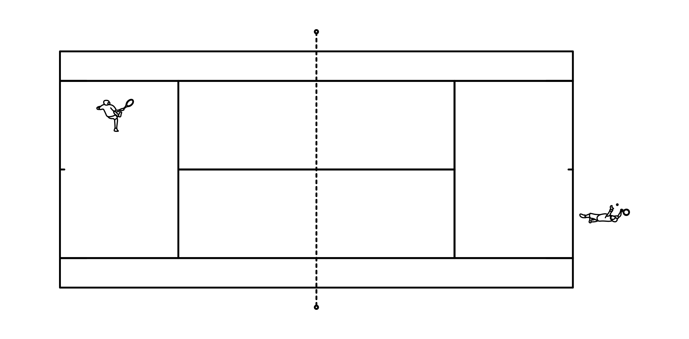
From the crop of the famous "T" on the tennis courts we were able to find the letters that form his name in a graphic and abstract way, forcing people to take a second look at this symbol.
Formation of the GUGA Kuerten logo.
The main colors were taken from the three main styles of courts: clay, fast and grass.
The movement of the tennis ball on the courts brought inspiration to build the other elements for the composition of the his visual identity.


 unpublished website
Brand New review︎
•
Agency: LDC
Brand Designer: Eduardo Tallia
Visual Identity Designers: Eduardo Tallia and Paula Padilha
Head of Design: Eduardo Tallia
Creative Directors: Cássio Moron, Fábio Saboya Sérgio Mugnaini and Raphael Franzini
Chief Creative Officer: Guga Ketzer