
ME(1987)
![]()
![]()
![]()
![]()
![]()
![]()
![]()
![]()
![]()
![]()
![]()
![]()
![]()
![]()
Wieden+Kennedy SP(2017)

Nike World Cup BNT(2017)

BR Native Ingredients(2019)

Tennis Court(2017)

Some Italic Letters(2015)

The Empty Shop(2013)
Made By Woodworks(2019)

Red Bull Station(2016)


AC Typeface(2019)

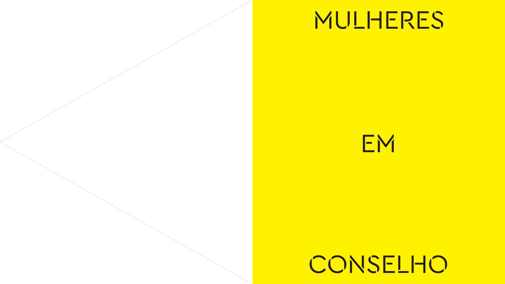
Women in Concil(2016)
Words To Watch(2016)

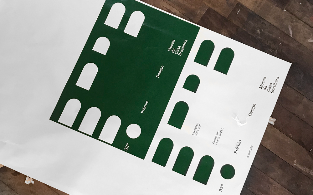
33º PDMCB(2019)
Tic-Tac-Toe(2012)

01
02
03
04
05
06
07
08
09
10
11
12
13
14
15
02
03
04
05
06
07
08
09
10
11
12
13
14
15
X
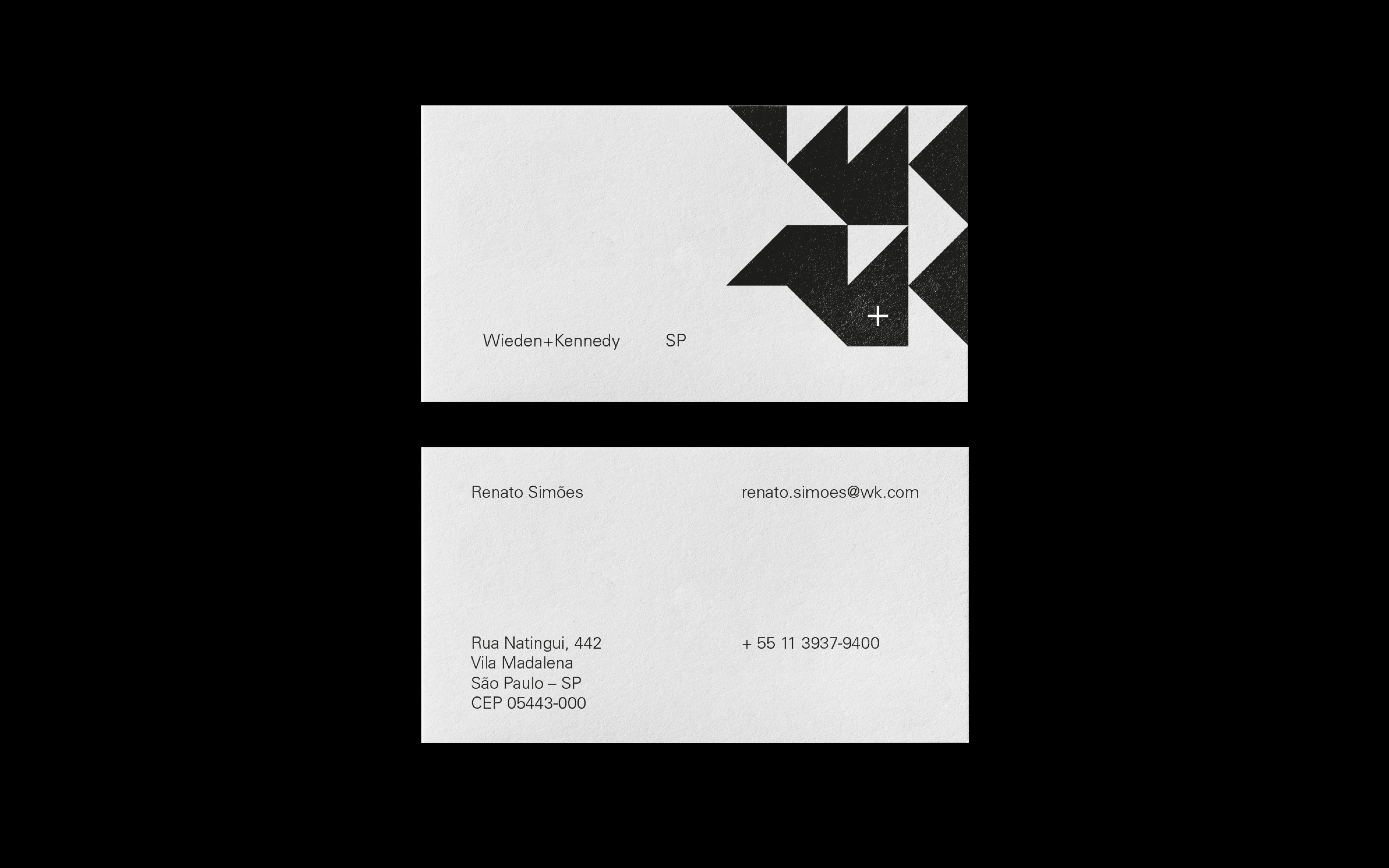
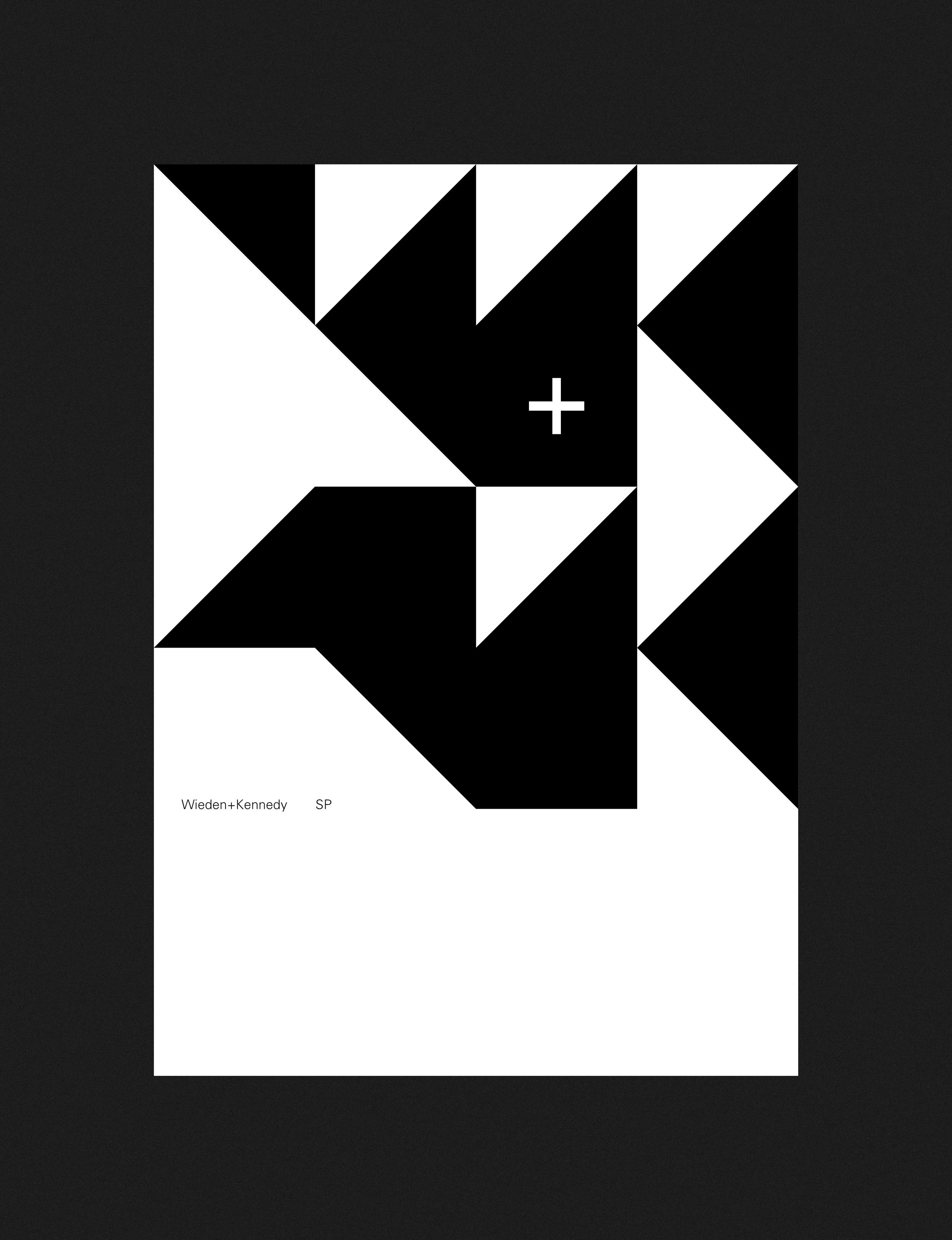
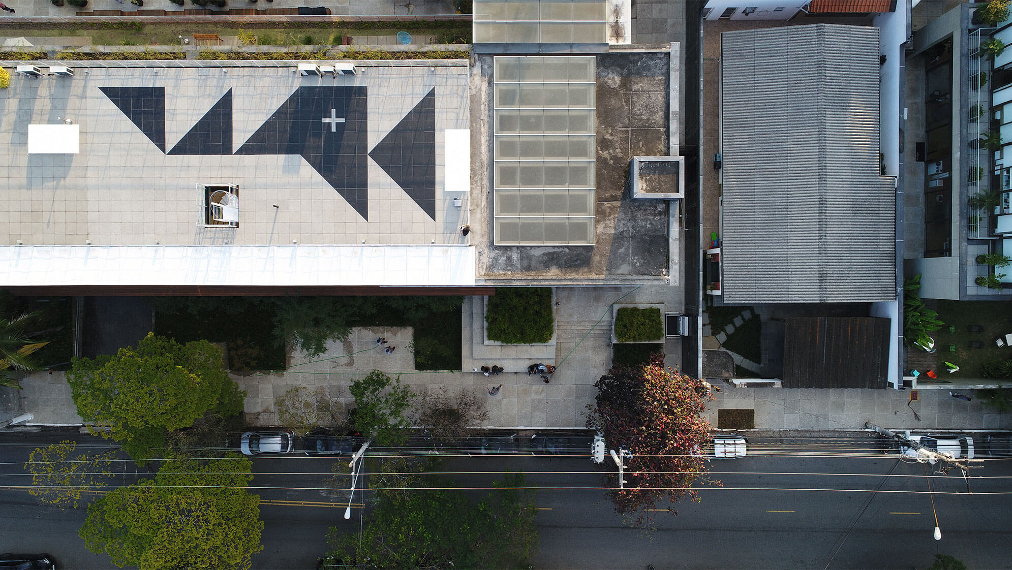
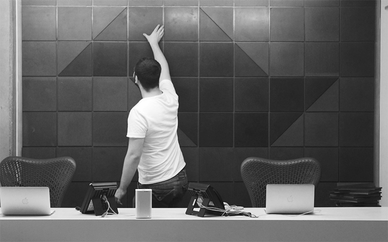
All Wieden+Kennedys from around the world pay their tribute to the city where it is present. It was on the sidewalks of the city of São Paulo︎ that we found the inspiration for the creation of the Wieden + Kennedy São Paulo visual identity system. The classic pattern behind the modules that graphically shape the map of the state of São Paulo was created in 1966 by the architect and artist Mirthes dos Santos Pinto︎. We realized that this composition works as a system formed by 3 forms.
![]()
![]()
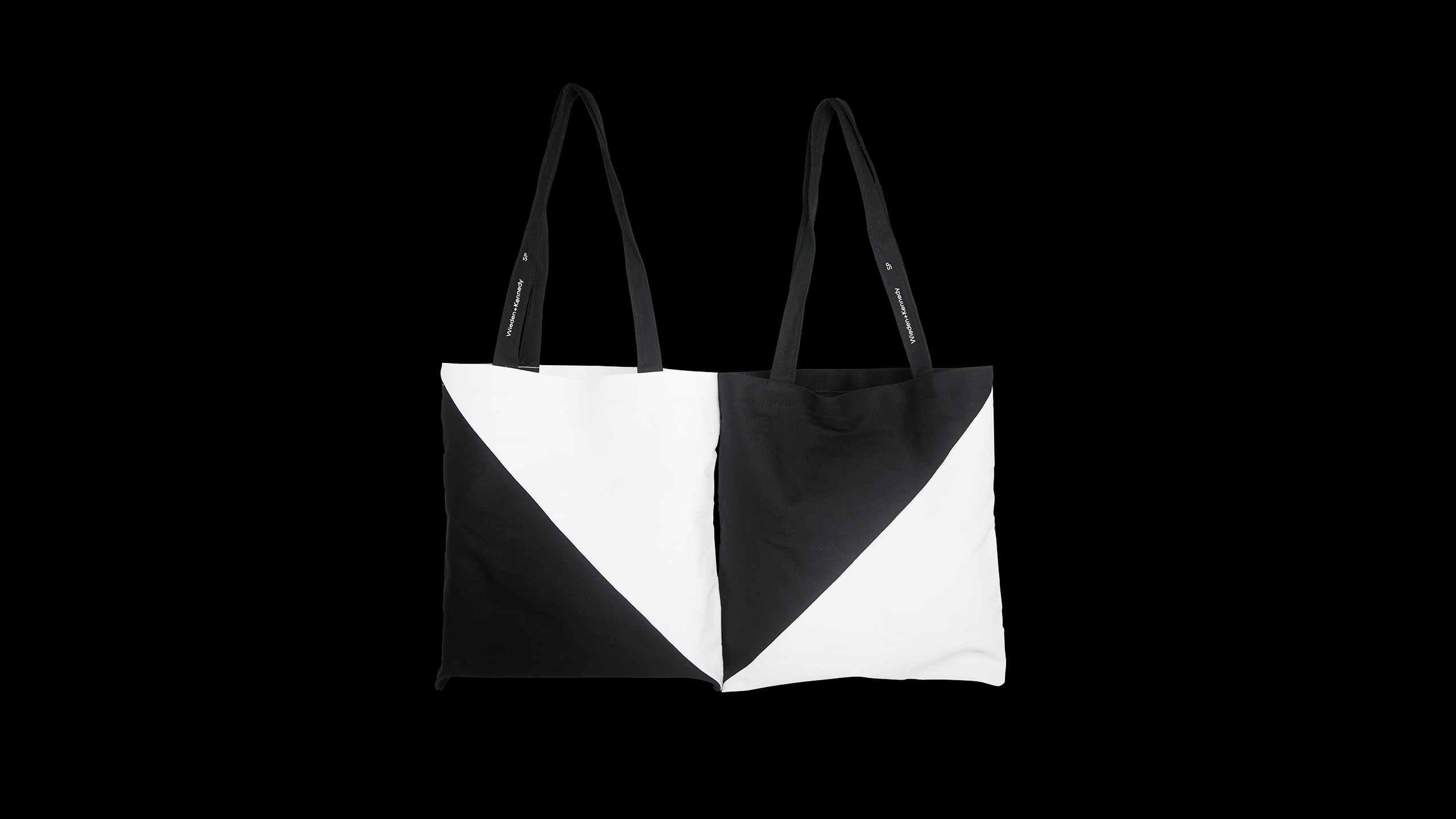
We interpret these shapes to form the initials W+K and build the Wieden+Kennedy SP visual identity system.![]()
![]()
![]()
![]()
![]()
![]()
![]()
![]()
![]()
![]()
![]() On the website we made an interpretation of the grid that makes sense with the dynamics of the platform. In addition we created an easter egg where the user can interact with the brand. Look here. ︎
On the website we made an interpretation of the grid that makes sense with the dynamics of the platform. In addition we created an easter egg where the user can interact with the brand. Look here. ︎
![]()
![]()
![]()
![]()
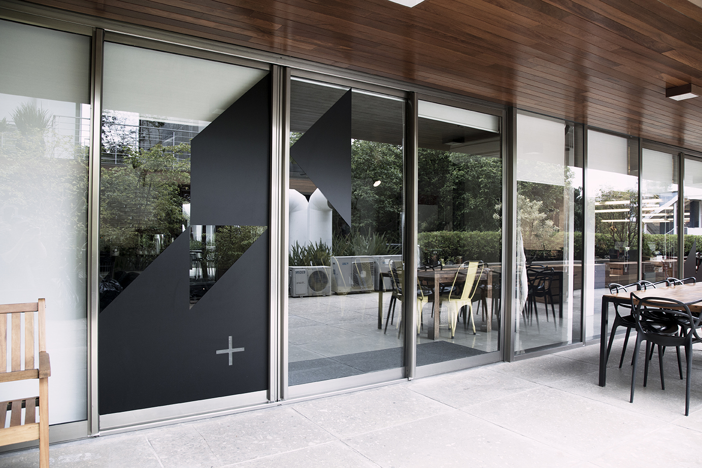
Door stickers at Wieden+Kennedy SP headquarter.![]()
![]()
![]()
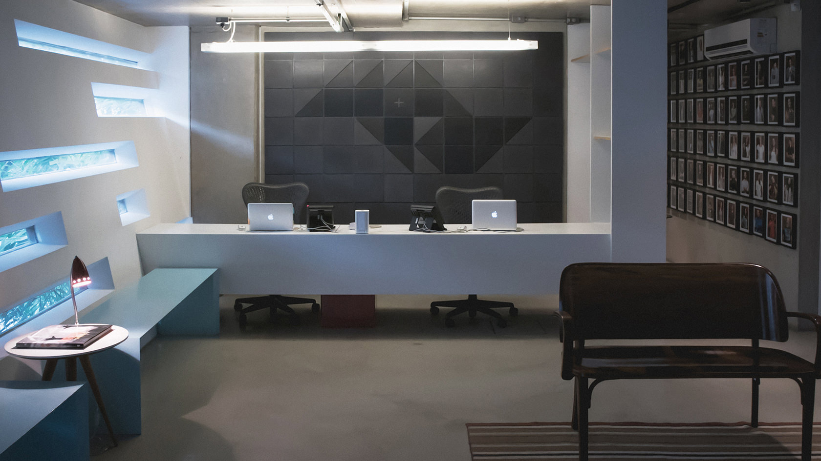
Panel project by Metro Arquitetos︎
![]()
![]()
︎
Agency: Wieden+Kennedy São Paulo
Executive Creative Directors: Renato Simoes, Edu Lima
Creative Directors: Caio Mattoso, Rodrigo Mendes, Bruno Oppido
Head of Art: Bruno Oppido
Copywriter: Rodrigo Visconti
Art Director/Designer: Eduardo Tallia, Fábio Cristo
Account Manager: Ramiro Del Cid
Producers: Rafael Gaino (digital), Jin Park (reception)
Reception Panel: Metro Arquitetos
Graphic Production: Produceria
Digital Production: Grafikonstruct
All Wieden+Kennedys from around the world pay their tribute to the city where it is present. It was on the sidewalks of the city of São Paulo︎ that we found the inspiration for the creation of the Wieden + Kennedy São Paulo visual identity system. The classic pattern behind the modules that graphically shape the map of the state of São Paulo was created in 1966 by the architect and artist Mirthes dos Santos Pinto︎. We realized that this composition works as a system formed by 3 forms.


We interpret these shapes to form the initials W+K and build the Wieden+Kennedy SP visual identity system.


 On the website we made an interpretation of the grid that makes sense with the dynamics of the platform. In addition we created an easter egg where the user can interact with the brand. Look here. ︎


Door stickers at Wieden+Kennedy SP headquarter.

Panel project by Metro Arquitetos︎
︎
Agency: Wieden+Kennedy São Paulo
Executive Creative Directors: Renato Simoes, Edu Lima
Creative Directors: Caio Mattoso, Rodrigo Mendes, Bruno Oppido
Head of Art: Bruno Oppido
Copywriter: Rodrigo Visconti
Art Director/Designer: Eduardo Tallia, Fábio Cristo
Account Manager: Ramiro Del Cid
Producers: Rafael Gaino (digital), Jin Park (reception)
Reception Panel: Metro Arquitetos
Graphic Production: Produceria
Digital Production: Grafikonstruct